1. app.json文件添加"custom": true
"tabBar": {
    "custom": true,
2. 新建组件文件/components/custom-tab-bar
3. 文件/components/custom-tab-bar/index.wxml
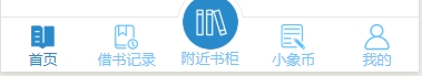
<view class="tabbar-container">
  <view class="tabbar-item {{active==0? 'tabbar-select':''}}" bindtap="switchJump" data-url="../index/index">
    <view class="tabbar-image" data-active="0">
      <image src="{{active==0? '/images/icons/avatar.png':'/images/icons/usercenter.png'}}"></image>
    </view>
    <view class="tabbar-text">首页</view>
  </view>
  <view class="tabbar-item {{active==1? 'tabbar-select':''}}" bindtap="switchJump" data-url="../borrowingRecords/index" data-active="1">
    <view class="tabbar-image">
      <image src="{{active==1? '/images/icons/avatar.png':'/images/icons/usercenter.png'}}"></image>
    </view>
    <view class="tabbar-text">市场合作</view>
  </view>
  <view class="tabbar-item tabbar-center {{active==2? 'tabbar-select':''}}" bindtap="switchJump" data-url="../address/disMap" data-active="2">
    <view class="mask-item">
      <view class="mask-border"></view>
    </view>
    <view class="item-center">
      <view class="tabbar-image">
        <image  src="{{active==2? '/images/icons/avatar.png':'/images/icons/usercenter.png'}}"></image>
      </view>
      <view class="tabbar-text"></view>
    </view>
  </view>
  <view class="tabbar-item {{active==3? 'tabbar-select':''}}" bindtap="switchJump" data-url="../coinRecord/index" data-active="3">
    <view class="tabbar-image">
      <image  src="{{active==3? '/images/icons/avatar.png':'/images/icons/usercenter.png'}}"></image>
    </view>
    <view class="tabbar-text">小象币</view>
  </view>
  <view class="tabbar-item {{active==4? 'tabbar-select':''}}" bindtap="switchJump" data-url="../myCenter/index" data-active="4">
    <view class="tabbar-image">
      <image  src="{{active==4? '/images/icons/avatar.png':'/images/icons/usercenter.png'}}"></image>
    </view>
    <view class="tabbar-text">我的</view>
  </view>
</view>
4.文件/components/custom-tab-bar/index.js
Component({
  /**
   * 组件的属性列表
   */
  properties: {
    pageActive: {
      type: Number,
      value: 0
    }
  },

  /**
   * 组件的初始数据
   */
  data: {
    tabbarHeight: "100",
    active: 0
  },

  // 在组件实例进入页面节点树时执行
  attached: function () {
    this.setData({
      active: this.data.pageActive
    })
  },
  // 在组件实例被从页面节点树移除时执行
  detached: function () {

  },
  /**
   * 组件的方法列表
   */
  methods: {
    //页面跳转
    switchJump: function(e){
      let url = e.currentTarget.dataset.url;
      wx.switchTab({
        url: url,
      })
    }
  }
})
5.文件/components/custom-tab-bar/index.wxss
view,cover-view,cover-image{
  box-sizing: border-box;
  padding: 0;
  margin: 0;
}
.tabbar-container{
  width: 100%;
  height: 100rpx;
  background-color: #fff;
  position: fixed;
  bottom: 0;
  left: 0;
  z-index: 9999999;
  display: flex;
  align-items: flex-end;
  border-top: 1rpx solid #e6e6e6;
}
.tabbar-container .tabbar-select{
  color: #298acb;
}
.tabbar-item{
  width: 20%;
  height: 100rpx;
  color: #71c6ff;
  padding: 10rpx 0rpx;
  background-color: #fff;
  border-top: 1rpx solid #e6e6e6;
}
.tabbar-item .tabbar-image{
  width: 100%;
  height: 50rpx;
  display: flex;
  justify-content: center;
  position: relative;
}
.tabbar-item .tabbar-image image{
  width: 50rpx;
  height: 50rpx;
}
.tabbar-item .tabbar-text{
  width: 100%;
  height: 30rpx;
  line-height: 30rpx;
  font-size: 26rpx;
  text-align: center;
}

.tabbar-center{
  height: 150rpx;
  border: 0;
  padding: 0;
  background-color: transparent;
  position: relative;
}
.tabbar-center .mask-item{
  width: 100%;
  height: 50rpx;
  overflow: hidden;
  position: relative;
}
.tabbar-center .mask-item .mask-border{
  width: 120rpx;
  height: 120rpx;
  border: 1rpx solid #e6e6e6;
  border-radius: 50%;
  background-color: #fff;
  position: absolute;
  top: 0;
  left: calc(50% - 60rpx);
}
.tabbar-center .item-center{
  width: 100%;
  height: 100rpx;
}
.tabbar-center .item-center .tabbar-image{
  position: absolute;
  top: 2rpx;
  left: calc(50% - 58rpx);
  width: 116rpx;
  height: 116rpx;
  padding: 5rpx;
  background-color: #fff;
  border-radius: 50%;
}
.tabbar-center .item-center .tabbar-text{
  position: absolute;
  bottom: 10rpx;
  left: 0rpx;
  width: 100%;
}
.tabbar-center .item-center .tabbar-image image{
  width: 100%;
  height: 100%;
}
6. 文件/components/custom-tab-bar/index.json
{
  "component": true,
  "usingComponents": {}
}
7. 页面调用:
<custom-tab-bar page-active="{{pageNum}}"></custom-tab-bar>
