示例1:

index.wxml
<view>
    <!-- Tab布局 -->
    <view class="navBox">
        <view class="titleBox" wx:for="{{tabList}}" bindtap="tabsOn" data-idx="{{item.index}}">
            <text class="{{item.index == tabsId ? 'fontColorBox' : ''}}">{{item.title}}</text>
            <hr class="{{item.index == tabsId ? 'lineBox' : ''}}" />
        </view>
    </view>
    <!-- 内容布局 -->
    <swiper class="swiperTtemBox" bindchange="slideOn" current="{{tabsId}}" circular>
        <!-- circular 启用循环滑动 -->
        <swiper-item>
            <view>装备内容</view>
        </swiper-item>
        <swiper-item>
            <view>活动内容</view>
        </swiper-item>
        <swiper-item>
            <view>功能内容</view>
        </swiper-item>
    </swiper>
</view>
index.js
Page({
  data: {
      // tab选项
      tabList: [
          {title: "装备",index: "0",},
          {title: "运动",index: "1",},
          {title: "功能",index: "2",}
      ],
      tabsId: 0, //默认选型为装备
  },
  // 滑动时触发的事件
  slideOn(e) {
      // 拿到当前索引并动态改变
      this.setData({
          tabsId: e.detail.current
      })
  },

  //点击tab时触发
  tabsOn(e) {
      this.setData({
          //拿到当前索引并动态改变
          tabsId: e.currentTarget.dataset.idx
      })
  },
})
index.wxss
.navBox {
  /* tab整体样式 */
  height: 100rpx;
  padding: 0px 20%;
  display: flex;
  align-items: center;
  justify-content: space-around;
  border-bottom: 18rpx solid rgb(243, 244, 249);
}

.fontColorBox {
  /* 选中tab样式 */
  color: black;
  font-weight: bold;
}

.titleBox {
  /* 未选中tab样式 */
  color: rgb(168, 170, 175);
  font-size: 28rpx;
  display: flex;
  flex-direction: column;
  align-items: center;
}

.lineBox {
  /* 线条样式 */
  width: 32rpx;
  height: 8rpx;
  background: black;
  margin-top: 10rpx;
  border-radius: 4rpx;
}

.swiperTtemBox {
  /* 内容样式 */
  padding: 16rpx;
  font-size: 28rpx;
  height: calc(100vh - 150rpx);
}
示例2:
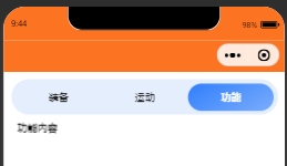
index.wxml
<view class="tabBox">
    <!-- Tab布局 -->
    <view class="navBox">
        <view class="titleBox" wx:for="{{tabList}}" bindtap="tabsOn" data-idx="{{item.index}}">
            <text class="{{item.index == tabsId ? 'fontColorBox' : ''}}">{{item.title}}</text>
        </view>
    </view>
    <!-- 内容布局 -->
    <swiper class="swiperTtemBox" bindchange="slideOn" current="{{tabsId}}" circular>
        <!-- circular 启用循环滑动 -->
        <swiper-item>
            <view>装备内容</view>
        </swiper-item>
        <swiper-item>
            <view>活动内容</view>
        </swiper-item>
        <swiper-item>
            <view>功能内容</view>
        </swiper-item>
    </swiper>
</view>
index.js
Page({
  data: {
      // tab选项
      tabList: [
          {title: "装备",index: "0",},
          {title: "运动",index: "1",},
          {title: "功能",index: "2",}
      ],
      tabsId: 0, //默认选型为装备
  },
  // 滑动时触发的事件
  slideOn(e) {
      // 拿到当前索引并动态改变
      this.setData({
          tabsId: e.detail.current
      })
  },

  //点击tab时触发
  tabsOn(e) {
      this.setData({
          //拿到当前索引并动态改变
          tabsId: e.currentTarget.dataset.idx
      })
  },
})
index.wxss
.tabBox {
  padding: 20rpx;
}

.navBox {
  /* tab整体样式 */
  height: 74rpx;
  display: flex;
  padding: 1.5% 1.5%;
  border-radius: 50rpx;
  background: #E5EEFD;
}

.fontColorBox,
.titleBox {
  /* 共同样式 */
  height: 100%;
  width: 100%;
  display: flex;
  justify-content: center;
  align-items: center;
}

.fontColorBox {
  /* 选中tab样式 */
  color: #fff;
  font-weight: bold;
  background: linear-gradient(151deg, #2F7EFC 0%, #7BADFC 100%);
  border-radius: 50rpx;
}

.titleBox {
  /* 未选中tab样式 */
  color: #1A1A1A;
  font-size: 28rpx;
  display: flex;
  flex-direction: column;
  align-items: center;
}

.swiperTtemBox {
  /* 内容样式 */
  padding: 16rpx;
  font-size: 28rpx;
  height: calc(100vh - 150rpx);
}
来源:https://blog.csdn.net/Shids_/article/details/124635859
